I was tasked with designing a logo for Opal Shield, a consumer product to help the inside of the mouth from the irritation from braces. The client wanted a blue logo, and to maybe play off of the name Shield. I sketched out several different concepts intially to get ideas on which way I wanted to go.
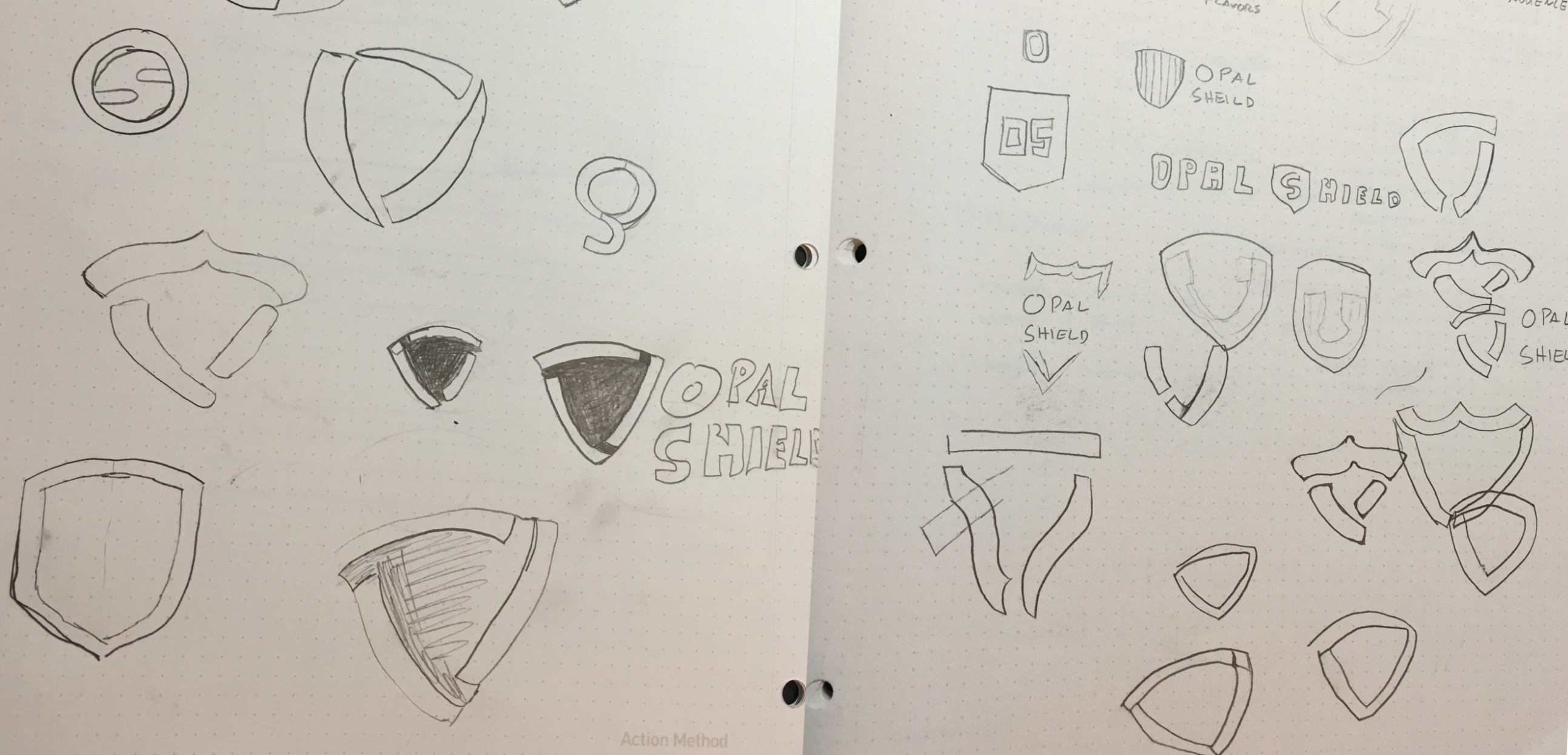
First Concepts
After working in Illustrator for a while these were the four concepts I initally came up with.
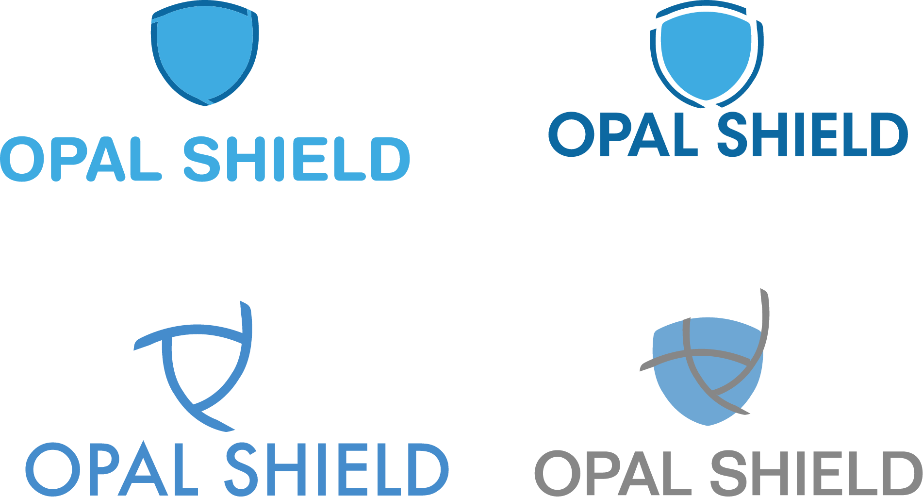
Second Concepts
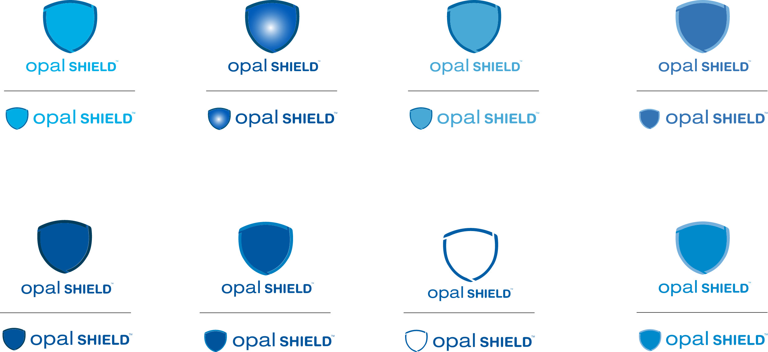
The client choose the mark and font they liked, but they weren't sure about the color choices, so I gave them several different options to choose from.
Final Logo